The claim
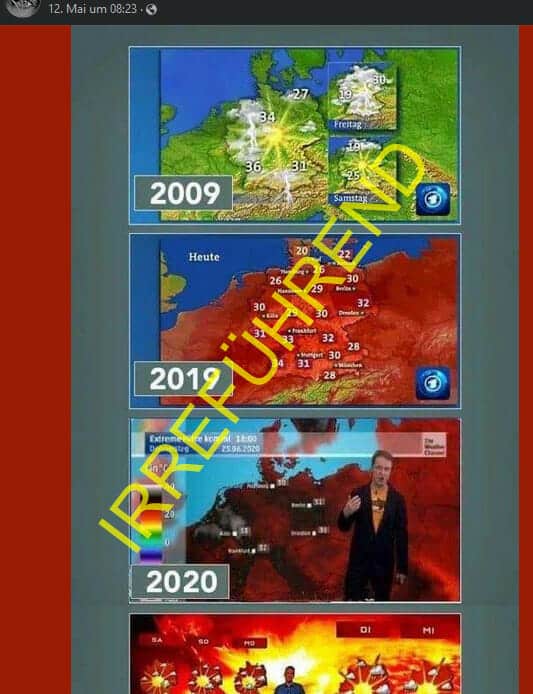
A sharepic shared regularly in the summer gives the impression that weather maps are increasingly colored red in order to make “climate hysteria” visually clear.
Our conclusion
Weather conditions with high temperatures were also shown in red in 2009. The Sharepic compares the map of a weather forecast (green) with a weather map (red).
In the midst of the turmoil surrounding the corona pandemic, the Russia-Ukraine war, monkeypox and the separation of Bibi and Julienco, there is also the rather unimportant and hardly noticed climate change.
This is supposed to be made subliminally conscious to us by the fact that the weather maps on TV news are colored more and more red over the years, even though the temperatures remain almost the same. But also in 2009, weather conditions with high temperatures were shown in red.
This sharepic is spreading again:

The Sharepic associates that in 2009 the weather map with high temperatures was simply green, but in recent years it has become more and more red. Clearly a manipulation, as one comment summed up at the time:
“Earlier, yes earlier…. There were temperatures like that too! There was no warning on the weather map! But today! It’s definitely because of these climate people!”
Weather preview vs. weather map
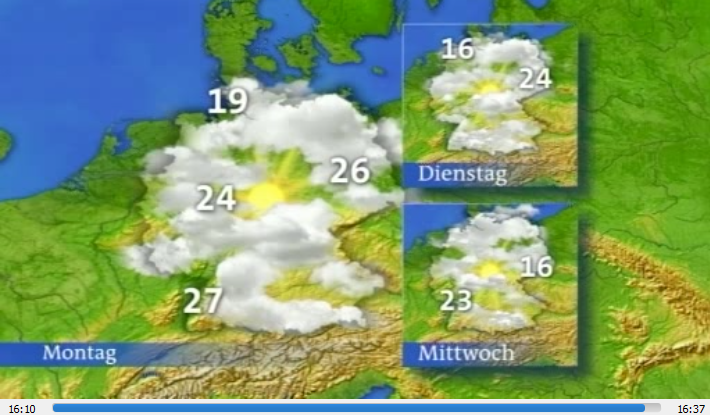
Unfortunately, it is not clear from the Sharepic when exactly this weather map is from 2009, but thanks to the media library we can take a look at a daily news program from 2009. Here we see a still image from minute 16:10, which corresponds in structure to the top image:

What we see in the picture above is the weather forecast for the coming days.
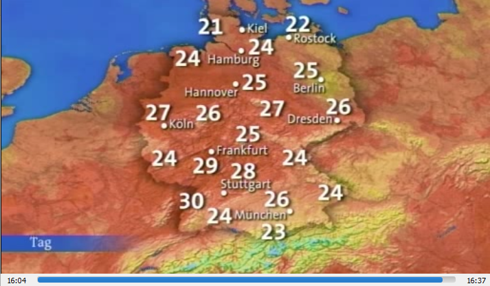
day's weather map a few seconds earlier in the same video

Anyone else surprised? Even in 2009 (and many years before that), weather with high temperatures was already shown in red!
So the 2019 weather map is not much different from the 2009 weather map. A “ But that looks a lot redder in 2019!” ” is not a real argument, as the 2009 media library recording is generally paler and has poorer resolution.
There's not much to say about the photo from 2020: It comes from the Weather Channel's weekly forecast of the weather in June 2020 (see HERE ), at that time there were extreme heats of up to 37 degrees.
The hellish weather map
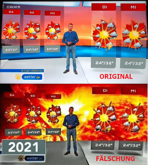
While the 2019 sharepic only showed two cards, another image was added in 2021 The last picture originally comes from an RTL news program, but in the sharepic the channel's logo was removed and the background was colored red.
Here you can see the original image that was shared , compared to the manipulated image from the sharepic:

Conclusion
The only manipulation is not a weather map, but the sharepic itself, because in 2009 weather conditions with high temperatures were already shown in red.
Incidentally, this red is not “just like that” distributed on the map (for example, in the 2009 image you can see 26 degrees several times, but underlaid with different shades of red), but rather it is the so-called isothermal map .
This means that it is not a subconscious manipulation of the audience through a colored weather map, controlled by whoever, but rather a way of representing the current weather that has been used for decades - which has always been red at high temperatures.
Notes:
1) This content reflects the current state of affairs at the time of publication. The reproduction of individual images, screenshots, embeds or video sequences serves to discuss the topic. 2) Individual contributions were created through the use of machine assistance and were carefully checked by the Mimikama editorial team before publication. ( Reason )

